Mappy Hour

Mappy Hour: Ben Carson’s America and Other Hilarious Maps

The Washington Post today reported on an awkward cartographic flub on a map of the U.S. by Carson’s staff. The graphic was meant to identify the states whose governors are opposing immigration by Syrian refugees. Not sure whether this goal was achieved, but we did learn from Dr. Carson’s new geography that:

  • Maine has invaded Canada,
  • “Vermont and New York now have hundreds of miles of new beachfront property,”and
  • Massachusetts apparently wants to be much closer to the Canucks up north, as well.

Carson America

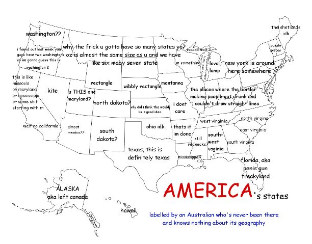
Carson’s poorly assembled jigsaw map of the states was only mildly humorous. The far funnier element of the article is this link at the end to “27 hilariously bad maps that explain nothing” compiled by Vox. The absolute best of the bunch is this Aussie’s attempt at labeling American states:

Aussie Map


Categories: Mappy Hour, Maps and Miscellany | 2 Comments

Mappy Hour: “What’s across the Ocean from You when You’re at the Beach?”

More maps! What could be better?

Seasonal applicability, that’s what.

As a contrast to our more typical random interest in intriguing maps, this post features cartographic insight that’s particularly applicable in August, the last month to fit in some beach time during summer vacation.

Ever wonder what’s out there when you gaze out at the ocean while laying out at the beach? Of course not! You just want to relax, not answer asinine questions.

Nonetheless, the friendly folks at The Washington Post‘s Wonkblog have now answered this question that no one was asking (but that we now find intriguing).

Here’s a quick view of the East Coast:

Across the Ocean

Boston – home to a record-breaking 110.6 inches of snow this season – is across from . . . balmy Spain. Who knew? The other maps present additional perspectives, both globally and by continent (and the West Coast).

The full article is available here. The coolest figure provides the “across the ocean” view for the entire Western Hemisphere:

World

Categories: Mappy Hour, Maps and Miscellany | Leave a comment

Mappy Hour: A Cartographic Cavalcade (More Maps)

As a follow-up to the previous post, herewith are:

A sampling from both of these (biased toward Europe, like our travels have turned out to be . . .) is below. A much wider variety can be found on these sites and the site listed in the previous post.

The ultimate stereotyping map of Europe – use this to plan your next trip! (Based on my family’s idealized perception of the Werners growing up, you’re all from Austria, according to the map.)

40 Maps They Didn’t Teach You In School Bored Panda - Mozilla Firefox 3152015 33544 PM.bmp

The only map you really need when traveling in Europe:

40 Maps They Didn’t Teach You In School Bored Panda - Mozilla Firefox 3152015 34209 PM.bmp

Pattern of barbarian invasions during the decline of Rome:

40 more maps that explain the world - The Washington Post - Mozilla Firefox 3162015 50522 PM.bmp

Subsequent Viking invasions and encroachment into the continent:

40 more maps that explain the world - The Washington Post - Mozilla Firefox 3162015 50526 PM.bmp

Prevalence throughout Europe of red hair (natural, I presume, and not the dyed magenta variety we encounter when visiting Central Europe):

40 Maps They Didn’t Teach You In School Bored Panda - Mozilla Firefox 3162015 52503 PM.bmp

A map of locations around the world Europeans actually did discover (inasmuch as they previously were legitimately uninhabited):

40 more maps that explain the world - The Washington Post - Mozilla Firefox 3162015 50434 PM.bmp

A map of all of the countries in the world England has invaded (all but 22, allegedly):

40 Maps They Didn’t Teach You In School Bored Panda - Mozilla Firefox 3162015 52432 PM.bmp

And, finally, a cartographic depiction of how mired in outdated measurement systems we are here:

40 Maps They Didn’t Teach You In School Bored Panda - Mozilla Firefox 3152015 33931 PM.bmp

Categories: Mappy Hour, Maps and Miscellany | Tags: , , , | Leave a comment

No Travel Update – Just a Cool Article on Maps

This article from the Washington Post offers “40 maps that explain the world.” Quite a few are really compelling and worth a look.

Distribution of alphabets:

40 maps that explain the world - The Washington Post - Mozilla Firefox 3152015 24517 PM.bmp

A political map of the world circa 200 A.D.:

40 maps that explain the world - The Washington Post - Mozilla Firefox 3152015 24613 PM.bmp

Geopolitical anomalies around the world:

40 maps that explain the world - The Washington Post - Mozilla Firefox 3152015 24559 PM.bmp

Categories: Mappy Hour, Maps and Miscellany | Tags: , , , | Leave a comment

Blog at WordPress.com.